 Favorite Tile | This tile has a nice balance to it. Everything is proportioned evenly on all sides of it. The opposite side is even with its pair. This tiles also has texture. The base of it has a bumpy texture that you can see as well. The shape is also important in this. This is a 4-D tile and it sticks up from the base. I feel as though making this tile was successful. It took a lot of time and it looks nicely sculpted and glazed. This is my favorite tile because i like the 4-D effect of it. It's not just flat on the base. If i had to do this one again, i wouldn't change it. I like it exactly the way it is. |
 Favorite idea
 This tile uses texture. When you move your finger across it, you can feel your finger sink into the veins on the leaf and the outline of it. This tile also uses line. The lines aren't straight, but they are rather curved. The outside of the leaf and the inside move together and towards each other. This work of art also consists of color. The main part of the leaf is a different color than the outside and the veins of it. I like the idea of this one because it's simple but I feel as though it's pretty as well. If i had to do this one again, the only thing i would change is that i would make my leaf stick out more. I would somehow make it 4-D.
Mug Evaluation
 | I used variety in my Georgia Mug. Both sides have peaches (plums) but the difference in that one side has the rivers in it and the other has a football. My Georgia mug is the outline of the state along with the "Georgia peaches." The rivers are carved in and they have a state football team. The Georgia bulldogs, but i only did a football. The Coca-Cola bottle is because Coca-Cola was created in Atlanta Georgia. The ceramics part of it was successful i think. It's a little rough but for the most p art looks good. The painting was a pain though. My peaches (plums) were suppose to be pink but i chose the wrong glaze. My football looks pale and my soda bottle has an odd color, but otherwise the rest of the glazing went fair. |
 |  |
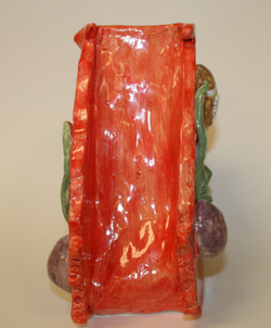
Bowl Evaluations
 |  |
Using geometric form, i created an elephant bowl. I also used balance. Everything that happened on one side, happened to the other. I also used unity. Everything fits together as one. I tied the crown to the elephant as being royal. The elephant is the king of its kind and its crown is over-sized. It fits right on its head and over the ears. I think that this work was successful. The painting could have gone better, but overall it looks good. I mixed white and black together to make grey and it ended up being green. I like it more now. It gives it uniqueness. The accidental part looks good. The ears also could have gone better. They look sloppy in a way, but also antique.
 | This bowl is almost like an drinking glass. The base of it made it very tall and because I placed two bowls together, it made it somewhat rounded. I used texture in the glaze around the main part of the bowl. It has a subtle bumpy feel. The inside is very matte feeling, which i like. I also used form/shape because the bowl is very rounded. There is an informal base of the bowl. The blue slivers aren't placed evenly on it. The mood of this bowl is very masculine. The colors are all sort of dark but the blue gives it light. I think this bowl was successful. I a lot of trouble making it. It kept on drying when it was in its clay form, and I wasn't done with it. The painting job looks good. It has a small antique feel. I like the obvious look of it being handmade. The feel of the whole thing feels good to hold and I'm happy with it. |

 RSS Feed
